A common theme in the job seeking world is to re-use the same CV over and over again when a new opportunity presents itself. Simply adding your last role and tasks to your employment history section is all that’s needed before it goes off again to a potential new employer – right?
Wrong! This is a terrible idea – simply making a few slight amendment to a CV you’ve had for years is likely to continue to decrease your chances of getting an interview each year that passes.
Is the fact that you’ve had a few job changes the main reason for changing your CV, or are there other factors? Here’s how to tell when you need a new CV:
Your work history only contains tasks
Many years ago, the standard way to create a work history section for a CV was to list all of the previous roles with job titles, tasks and responsibilities, and a timeline. In today’s competitive job market the employer is looking for much more – but what exactly?
Your performance is just as important to an employer as the huge amount of tasks you’ve listed. If your job titles are similar to the new role you’re applying for, then most likely the hiring manager already has a good idea of what you did, and wouldn’t always need a large list of daily tasks taking up most of the page anyway.
Having the right skills and experience for a role is of course very important, but that extensive list of experience still doesn’t tell the employer how you performed and whether or not you are worthy of working for their company. Instead of focusing on trying to cram every single task you’ve ever completed onto your CV, you should inject more performance related information.
Rather than saying you ‘successfully negotiated numerous contracts’, you could say that you ‘negotiated four contracts worth over £250,000 during the 1st quarter of 2018’. This second example gives a much more detailed explanation of how you performed.
Research by The Ladders in 2018 revealed that the best performing CVs incorporated bold job titles supported by bulleted lists of accomplishments.
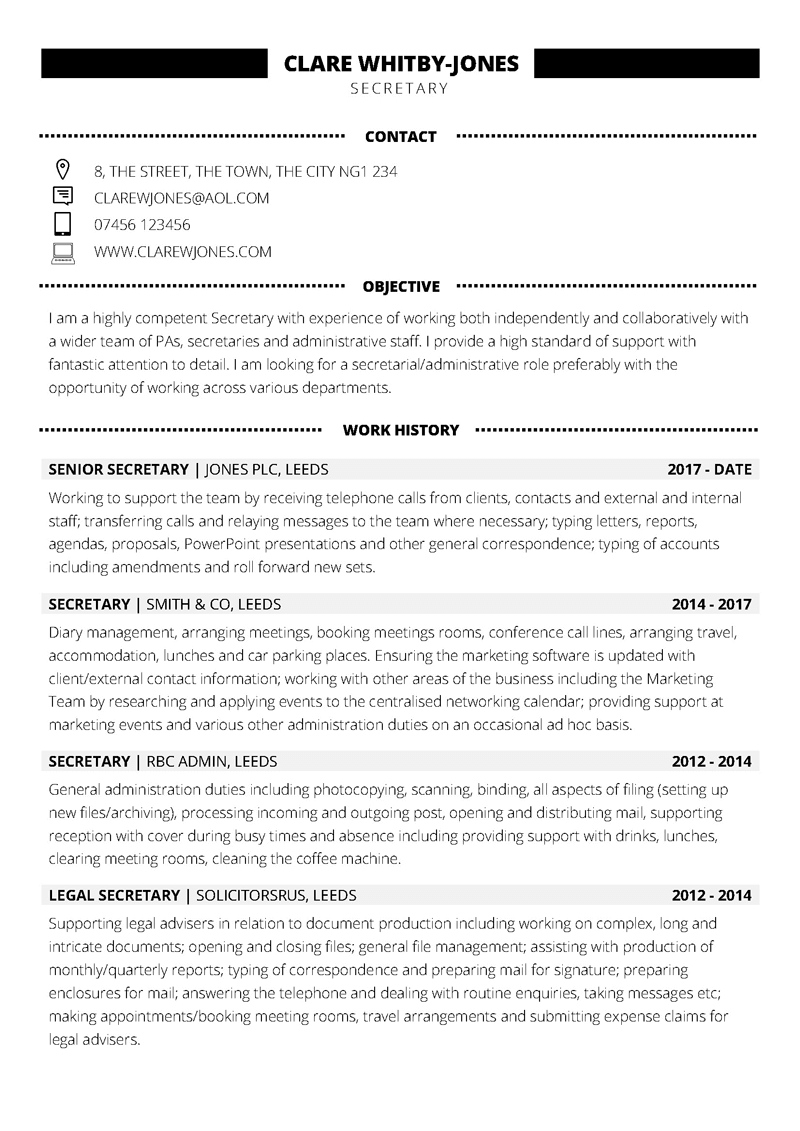
Your CV is in plain old black and white

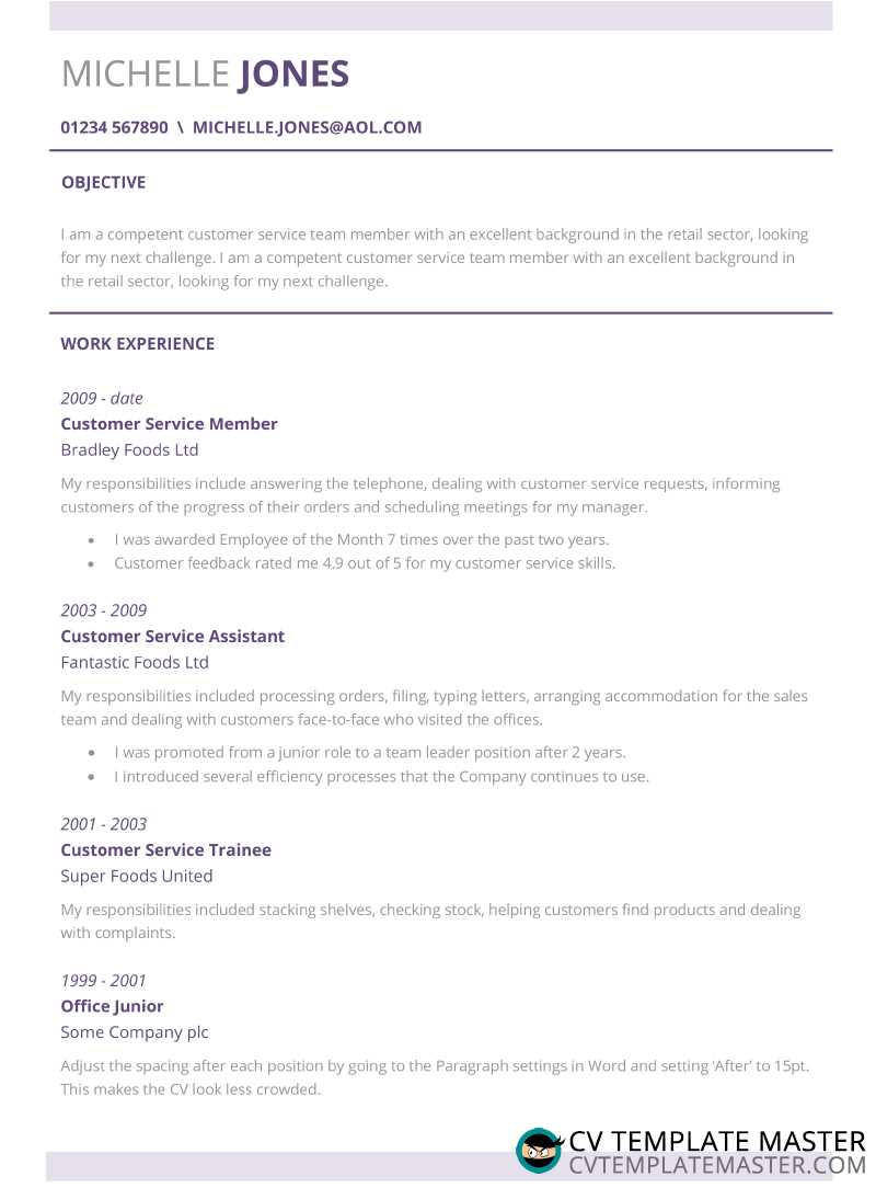
Above: This aptly named subtle CV template is a great example of how much colour is ‘enough’ without being ‘too much’. You can download this free template here.
Technology now allows us to easily add a little colour to many things, which means we don’t need to keep the same old tired CV format of black and white. Although it still looks professional, your CV would struggle to compete against more modern templates that present the information in a much brighter way.
For your first time experimenting with colour on your CV, we would advise going for lighter colours like yellow, blue and green. Sometimes even just a little bit of colour at the top of your CV where your contact details are can draw the eye of the hiring manager to your application, and get things off to a great start.
You’re not using a CV template

Above: This CV template shows how you can balance a little design flair with a clean, clear and easy-to-read format. You can download this free template here.
A ready made professionally designed CV template is essentially a template which allows you to insert your details straight onto the page. This saves a huge amount of time, stress and hassle of having to create your own from scratch – and they look darn good!
With the recent increase of online help, employers are now receiving a much higher quality of CV. A very popular way of presenting a CV is to use a template found for free online. Not only is this a great way to save time, it will also allow your details to be presented in the very best possible way to an employer.
There are not many people out there that can create a CV template better than what’s already available for free online, and when up against so many other candidates that have used a CV template, you could be taking a huge risk by not doing so yourself.
If you’ve been updating and using the same CV for many years now, you need to consider using a brand new CV template to give your application a much needed revamp.
However, a word of caution – don’t go over the top with the graphics. Stick to a conventional format that employers would expect, with minimal style details to help you stand out.
“Employers hate overly complicated or fussy designs. They are used to finding the information they need in certain places, they don’t want to hunt for it.”
Researchers at The Ladders (see link above) found that the best performing CVs utilised a simple layout with clearly marked section and title headers, all written in a clear font.
You haven’t included a mission statement
Mission statement, objective, personal statement, personal profile …
It’s been called many things by many people – but whatever you call it, it has the same basic formula. Your mission statement sets out:
- Who you are
- What you have to offer (with reference to the job spec)
- What you’re looking for
It’s a really powerful way of grabbing a prospective employer’s attention and informing them in just a few seconds that you’re right for the job.
Research by the Ladders (see link above) revealed that the most successful CVs include a detailed overview or mission statement, primarily located at the top of the first page.
Watch this video by Graham Martin (the ‘Recruitment Guy’) for the ultimate guide to writing a mission statement that lands you more interviews: